My name is Dr. Mata Haggis and I was the narrative & game designer/producer on Fragments of Him, our entry to Ludum Dare 26.
I had never done a game jam before, so this was a new experience for me. I was fortunate enough to have two talented developers ask me to join their team. Between us we created a narrative game experience with one programmer, one artist (and his 3D modeller girlfriend for an evening), and myself in only 72 hours.
Below you will find out what a narrative designer does on a game jam, what a producer can do, and a little more about the decisions that I made when creating the title.
Before we go any further you should play the game:
http://www.kongregate.com/games/Aceria620/fragments-of-him
Seriously. I mean it. This post will have a lot of spoilers very soon, so go play the game now and come back in ten minutes.
Done that?
Really?
Okay, let’s talk about the process…
Starting
All game jams have a theme, and this one’s theme was ‘minimalism’, and I wanted to do a game with a very prominent story in it. I worked on several ideas in my head, but the one that stuck was investigating why a person would choose to live in a minimalist style in their house. The result of this was the idea that the lead character had lost their partner and couldn’t stand to be reminded of the loss.
In narrative terminology, the loss of the partner would be referred to as ‘the inciting incident’. The process of creating minimalist spaces gave me a gameplay mechanic too.
I pitched the concept to the team – one artist and one programmer – and I was fortunate that they were enthusiastic about it. There were several key decisions that are worth examining here:
Scope
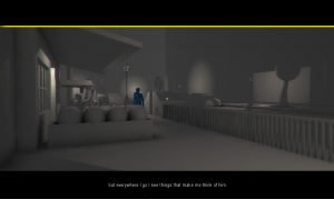
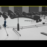
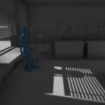
The theme was going to need a lot of art. Specifically, the world was going to need a lot of models in it. I immediately said that the world was going to be stylised and colour coded: the protagonist (the ‘hero’ of the story) would be blue, and yellow would be used to indicate the dead partner, along with objects related to that partner. Everything else in the game was going to be white – this would allow the artist to focus on building the space and objects without worrying about texturing any of it.
In terms of showing figures in the environment, again I needed to keep a close eye on the scope of the project. I asked the artist to create one generic character model which would be used for both the protagonist and the dead partner. In every scene, these figures would be posed in a tableau (a static pose that suggests narrative action). In this way we could give a powerful idea of character relationships without the difficulty of animating figures.
For the programmer, there were a few challenges that I had to consider. The audio and subtitles would need to be displayed, there would need to be highlighting and signposting of affordances, and the most difficult task was probably going to be the final scenes where the gameplay mechanic (clicking to remove objects) is reversed. By keeping these interactions very simple, I could limit the complexity of the task that I was giving to the programmer.
Sexuality
I voiced the lead character of the game, and I am male. In the game, the character talks about his dead boyfriend. I felt that the story would work perfectly with either a male or female partner character, but I also feel that non-heterosexual relationships are under-represented in gaming, and so I had a preference for making both characters male.
I described the outline of the story to the team and they had no feelings either way on the gender of the partner, and so we ended up with a story about coping with grief, where the lead characters happen to both be male.
When stories are told about the death of a gay man, they often focus on stereotypical perceptions of gay lifestyle choices: drugs, promiscuity, clubbing, and of course HIV/AIDS. I didn’t want to tell a gay love story; I just wanted to tell a love story.
I know that the audience for any story will be predominantly heterosexual, with then lower proportions of gay, bisexual, and transgender players. Part of my goal was to ignore the non-heterosexual elements and to write a story that anyone could relate to. I did this by choosing to focus on the small things in people’s lives.
I suspect that anyone who has had a break-up, especially after living with a partner, can relate to the quiet sadness of removing one towel from the bathroom. I think that feeling of sorrow is a universal experience that has nothing to do with sexual preferences, and that is what I wanted to convey in this game.
A benefit to the choice of going for a homosexual relationship was that the artist only needed to make one body and animation rig, saving him a lot of time!
How to write a good story quickly
I’ve been writing for several years and have cobbled together a system which works well for me. I’ve based it on several sources, but the main ones are ‘Save the Cat’ by Blake Synder:
http://www.amazon.com/gp/product/1932907009/ref=as_li_ss_tl?ie=UTF8&camp=1789&creative=390957&creativeASIN=1932907009&linkCode=as2&tag=theothersid08-20
… and ‘Will Write for Shoes’ by Cathy Yardley.
http://www.amazon.com/gp/product/0312359004/ref=as_li_ss_tl?ie=UTF8&camp=1789&creative=390957&creativeASIN=0312359004&linkCode=as2&tag=theothersid08-20
Neither of these are high-brow books on how to create your epic masterpiece, but they are very focussed on creating a tight, enjoyable story.
I put ideas from the books together and now here’s what I use whenever I start writing:
| Before the inciting incident – ‘Save The Cat’ |
| Show the life of the character before life goes wrong. The character does something that makes you like them (‘save the cat’). |
| 5% – Inciting incident |
| Something changes that forces the protagonist to act. |
| 25% – Plot point one – state the external motivation |
| What forces the protagonist to make this clear statement of their objective? |
| 50% – Plot point two – the low mid-point |
| It appears impossible to complete the external motivation, protagonist loses hope |
| 75% – Plot point three – Hope |
| The protagonist is given hope that they can fulfil their external motivation goal, but only if they truly dedicate themselves to it. |
| 90-95% – “The Black Moment” |
| The external motivation appears impossible to fulfil. |
| 95%-100% – Resolution |
| The story concludes in a satisfying manner – this may be successful completion of the external and internal motivations (a happy ending), it may be a failure on external motivation but a success in the internal motivation (common in comedies, romance, or tales of self-discovery), success of external motivation but failure of internal motivation (common in tragedy and tales of self-discovery). It is not typical for a story to end with failure of both external and internal motivation – this is the total failure of the character to grow or succeed and makes an audience wonder why they spent their time with the character. |
I use this whenever I write and it’s working out pretty well for me so far!
In the case of Fragments of Him, as with other stories I write, I began from a feeling and worked back to an inciting incident. The feeling was a person clearing away all of their belongings to create a minimalist living space – why would they do this? This question led back to the inciting incident – the objects were related to grief at the sudden death of a partner.
From there I worked through the template, filling in the gaps. For Fragments of him, it looks like this:
| Before the inciting incident – ‘Save The Cat’ |
| Scene – Park. Feeding ducks, narrator talks about how good life is.Two characters – protagonist is blue, the ex is yellow. All other objects are yellow too.
The player clicks on objects (or parts of objects) in the scene, they turn transparent. |
| 5% – Inciting incident |
| End of first level – the player has been removing the polygons, when everything is transparent except for the main character – the partner dies. |
| 25% – Plot point one – state the external motivation |
| Scene- House. Protagonist wants to remove all traces of the ex from his life. |
| 50% – Plot point two – the low mid-point |
| Scene – Street . It appears impossible to remove everything – everywhere he goes there are reminders. He doesn’t want to go outside. |
| 75% – Plot point three – Hope |
| Scene – Office. If he can remove everything from his interior spaces he feels like he might be able to cope. |
| 90-95% – “The Black Moment” |
| Scene – back in the empty House. Protagonist is sitting on the floor. Ex appears behind… The protagonist feels like he will never be free of the memories, even when everything is gone. |
| 95%-100% – Resolution |
| As the player clicks to remove the ex from the House scene, the protagonist’s colour changes, blending the two into green – the ex has become part of the protagonist. The player clicks through the scenes, where the transparent objects are back. As the player clicks on the transparent objects they turn green too. This goes much faster than the removal.The protagonist understands that the ex is part of him. Things are different, but life will go on in a new way. |
As you can see, I’ve used the basic structure from the template to create a narrative arc that is satisfying and also that integrates with the gameplay – at each step I have made sure the interaction with the game adds to the plot.
I chose locations where it would be viable to have few characters in the scene because of the limitations on the art scope.
Dialogue
There are three variations of most of the instances of dialogue in the game. These are chosen randomly during each play through, giving a slightly different experience for each time.
The dialogue was written with three key events in mind:
- The start of a level
- Removing a particular object or a percentage of objects
- The end of a level
The start and end triggers would give the main plot points, and the objects would trigger smaller memories.
I recorded the audio in a make-shift audio booth constructed from a pair of curtains and a clothes rack on a €100 digital microphone. It’s not ideal, but it did the trick. I then edited the sound files into one or two sentence chunks with some antiquated software. This was very laborious and time consuming for me, but sometimes design requires this kind of repetitive grunt work to get the project done.
Other audio
Ambient audio and music is absolutely essential in selling any emotional experience: I believed this going into this project and now I am utterly convinced of this. In every scene there are several audio triggers built into the environment that work in a very subtle way to make the spaces feel more believable.
I have a suspicion that the audio space of a game may be more important than the visual style when it comes to creating emotional resonance. Most of this work will never be noticed by the player on a conscious level, but that it exists in the mix is important. In the apartment, did you hear the muffled footsteps of a neighbour going down the hall? Or in the office, did you notice the sound of typing outside the room, or the noise of a plane flying past overheard? Probably not, but they’re there, and they help you feel that the space you are in is alive.
For the music, I found a wonderful website of free music: https://musopen.org/
Everyone on the team instinctively felt that a piano score would suit the mood. I tried several pieces and found a 14 minute piece by Chopin that fitted the feeling I wanted to create… Then I had the laborious task of trying to cut it into pieces that would loop naturally.
Sound effects were more difficult: I wanted to get musical notes again but failed to find a copyright free source for these, and so I used generated audio tones with echo effects on them. It’s not ideal, but it does have the advantage that they contrast clearly with the ambient and musical soundtrack of the game – clear audio feedback is good, although perhaps this could be more polished.
Environmental storytelling
To begin with I found a lot of reference material for the spaces that I wanted to create for the game. I recently went on a trip to London (possibly the greatest city in the world for any form of storytelling) and had decided that the story would be set in a location similar to Knightsbridge and Hyde Park.
We set up a shared Dropbox folder and so all of the reference material was instantly shared across the team.
As the artist worked, we often talked about ‘exactly what kind of lampshade would he have in his office’ or ‘what does he have on the side in his hallway’. Every time I was asked a question like this I would always think back to how I imagined the characters to be, what kind of people they are, and what their priorities are in life. Wherever possible, the art was always created to support the characters: if it didn’t say something about the people that owned the object then we would keep looking until we found a better, more expressive choice.
Sometimes the artist would create a space that inspired these choices. He modelled the handles on a drawer for the apartment in a particular way that made me realise that my characters were a little old-fashioned in their choices, or the filing cabinets were placed away from the wall in the office, and I would see that and decide that the character might have dropped a book down there but felt too depressed to be bothered about the effort of retrieving it. This iterative loop was very rapid, where I fed the artist ideas, and his responses inspired me to understand my characters more.
Interface design
We wanted to keep the interface minimal, but there needed to be various elements to help the player understand what they needed to do. These were designed by me, but implemented by the programmer on the team.
Here is a list of events and the feedback I designed:
Reticule – not on object: Reticule is white
Reticule – on clickable object – (before second house scene): Reticule is yellow
Reticule – on clickable object – (during second house scene): Reticule is green
Reticule – clicking on empty space: Reticule pulses blue
Note that I also designed negative feedback (when the player clicks but there is nothing to remove from the game at that point). It is always important to make sure that the player knows when they are doing something wrong! Audio cues were added to support the visual positive and negative feedback systems.
In the world, we had highlighting in yellow, the colour of the dead boyfriend, to show objects that could be clicked on. There was a yellow bar at the top of the screen that got smaller when the player removed more yellow objects, and on the title screen the buttons were highlighted yellow when you started the game.
After testing with a non-gamer, we found that this still wasn’t sufficiently clear, and so a pink outline was added to objects that could be clicked but were too far away…
Which still wasn’t enough, and so we added a timer that means that clickable objects pulse slowly yellow after the player has been on a level for two minutes.
Bug tracking
I created a spreadsheet of the bugs for the game, allowing us to test, iterate, and improve all of the game over the last twelve hours of the game jam. It seemed trivial when I started the spreadsheet, but as the day wore on it proved to be invaluable in helping us focus our attention.
Lessons
I need to upgrade my audio recording equipment and learn some more modern audio software. This part of the process was extremely time consuming and I feel that the quality of the audio could have been improved if I my skills in this area were more advanced.
Try and arrange to have an actor available for the weekend! My vocal performance is sufficient, but I think we could have added more emotion with a more powerful performance.
Convey the most difficult scenes more clearly to the programmer as early as possible. I don’t feel I did a good enough job in getting across my idea for the ending of the game at an early enough stage, resulting in pressure on the programmer at the end of the three days. If I had handled that better then maybe the ending could have been more polished.
Even with all of the highlighting on the interface, we still get comments that people find it frustrating to find the last object in a scene. What can I learn from this? Well, HIGHLIGHT ALL TEH THINGS! And that MOAR HIGHLIGHTING STILL is one way to go. Really – it’s hard to understand just how much highlighting is needed… But of course this has to be balanced to not break the mood of the game. Tricky. The other option would be to allow players to progress after they have got most of the objects and not require 100% completion… I don’t know about that. Many people like playing to completion, but I suspect a narrative game needs to remember that the story is more important than 100% completion. Believe me when I say that this balance is something I will think deeply about on future projects.
Testing the game resulted in big improvements on the interface. I definitely want to do this for future games I make – I think this probably doesn’t happen often for game jam creations!
Conclusion
I’m very proud of what we have created. As the first few comments started rolling in about players starting to cry while going through our game, I couldn’t help but think of Steven Spielberg when he said that games would only be art ‘when somebody confesses that they cried at Level 17.’
I’ve made games where you rip the heads off of space marines, games where you slam cars into each other as fast as you can, or where you control a monkey in a spaceship collecting space-bananas. I’m proud of those games in their own ways, but this game was very personal for me.
We have all felt loss at times, or incapable of coping with grief, but this is normal. We are supposed to feel like that sometimes, and we just have to learn how to cope with it. When I say ‘we have all felt loss’ I mean that I wanted to show the universality of these feelings, gay, straight, and all the places in the middle and completely off the sides too. These are things that we share, and dividing our stories also divides us as a society.
I wanted to convey a message about acceptance and hope, and ultimately make people feel that there is always something more to look forward to. I have always believed that games could do that, but Fragments of Him has proved this to be true, at least for some players. I feel incredibly inspired by this experience.
My thanks go to Tino and Elwin from the award winning SassyBot Studio (http://sassybot.com/) for asking me to join them on this adventure, and thank you for reading this post-mortem of our game.
—
About Dr. Mata Haggis:
I’m a games & narrative designer with over ten years of experience of making both indie and AAA games, and writing for games, television, webcomics, and print. This blog will track my work on interactive creations (and possibly some of the non-interactive work I do too).
For nearly three years I have been teaching the next generation of games developers on the IGAD (International Games Architecture & Design) programme at NHTV University in Breda, The Netherlands. It’s a very highly rated course, taught entirely in English, and if you’re interested in learning more about games development then I highly recommend it:http://made.nhtv.nl/


